[Note: Check This $#!% Out was originally a seperate blog but is now a feature of patokon blog]
Everybody loves Harley! Right? She’s quirky and funny and petite (depending on who is pushing the pen) and gothish-ish and very naughty. She’s able to make us sympathize with that madman, The Joker just as Robin made the Batman more accessible. She was born in the 80’s animated Batman show and animated-world Harley is always much more fun than the “canon” comics Harley.


This is completely un-ironic and unfunny and a bunch of other uns. RING RING anyone? Phoning the $#!% in...


 PURR!!!

Overall, it was a bit of a mess and there were some major disappointments. I was able to discover a few artists I'd never heard of before and I've followed their FB or tumblr or blogger blogs. I'm guessing that this was a last minute thing and a lot of favor chits were called in. I hope it was worth it, guys. I really do.
So why did I buy Harley Quinn #0 written by Amanda Conner and Jimmy Palmiatti after I was so disappointed with the last timeshe had her own series?
4 names – Timm, Cooke, Hughes, and Kieth (that’s how you spell it!).
More than anything I wanted to see how BruceTimm would interpret Harley’s recent costume. A page of that right there would be worth the cover price to me, a die-hard Timm fan.
Darwyn Cooke is one of my all-time faves and has earned mega-respect from me for his Parkeradaptations. Adam Hughes is talented and funny and the king of good-girl/bad-girl art. And Sam Kiethis creator of The Maxx (great comic, interesting animated show (I have the VHS and nothing to watch it with #fortysomethingproblems)) and Zero Girl (and he penciled the first five issues of Neil Gaiman’s The Sandman AND issues #6 - #9 of Adolescent Radioactive Blackbelt Hamsters – aren’t you glad you asked).
Did I like it? Was I wowed by the compilation of all this great talent? Dave Johnson, WaltSimonson, Jim Lee – all biggies and Tiny Titans artist Art Baltazar is the only tiny-hero artist out there worth a damn (this topic deserves its own Talking $#!% entry). So, LOTS of talent here. But did I like it?
Read on, intrepid reading-person. But first, a warning!
SPOILERS AHOY! (Mostly visual)
Now I’m going to do a walk-thru of Harley Quinn #0 commenting on the art as there is no real story to speak of. It is a 4th-wall busting romp with the not-very-esteemed Harleen Quinzel MD deciding who should be drawing her new comic book series. The dialog with the writers is unsettlingly awkward (one of the first things she does is insult her potential readers. I hope the tone of the series is better). I think they’re trying to be clever, but they’re not trying near hard enough. Overall, there are some surprises art-wise (not all positive) but the phones must’ve been ringing off the hook because there is a lot of “phoning-it-in” if you catch my Tokyo Drift.
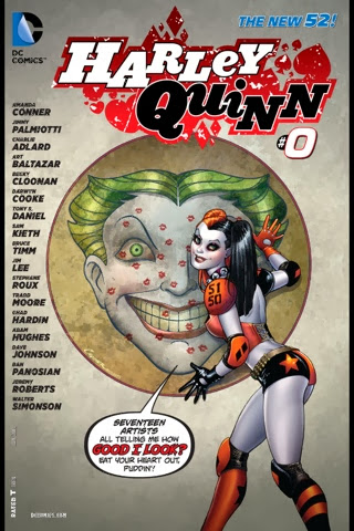
Amanda Conner did the cover and the first 2 pages.
As I’ve always liked Harley’s mask, I’m already biased against the face on the cover. She’s got a skewed personality and I suppose that’s why her face is so weird, but I prefer innocent/crazy Harl to pure evil/crazy Harl. Unfortunately, that only seems to work in the animated world. One plus is, I dig the roller-derby outfit. Roller derby is way hot.
The interior page HQ is much more to my taste. She’s prettier than the skewed face on the cover and I don’t mind the new make-up as much here.
(P. 3) I love the take Becky Cloonan tooked as she takened her take on Harley. This page has a cool indie feel to it that rocks.
(P. 4) I like the face on Robo-Harl by Tony S. Daniel & Sandu Florea. She calls herself Harley-zilla which is riDIC because Godzilla is a living energy beam-breathing kaiju, and this is obviously a robot.
(P. 5) Stéphane Roux got to draw a Coast Guard Harl surfing on a dolphin and taking out pirates. Some good stuff on this page, and I only dislike HQ's nose shape (I like the bobbed nose, so sue me!).
(P. 6) Dan Panosian did a fantastic homage to early MAD that is fun, funny, and drop-dead sexy. May be the best page in the whole book.
(P. 7) Walter Simonson may have been awesome on Thorand I loved Star Slammersduring my big robot and ninja phase, but THIS…
This is completely un-ironic and unfunny and a bunch of other uns. RING RING anyone? Phoning the $#!% in...
(P. 8) I have a bone to pick with Jim Lee for not even bothering to hand in a page of art. He just redraw Harl's costume on an old page (and I assume Scott Williams was dragged in to re-ink).
Not cool. They joke about it, but obviously they wanted his name on the book even though he couldn't actually contribute anything to it. LAME!
Poor JL fanboys who spent good money on this are crying in their malted scotch (mojitos maybe?) while I laugh because my hero won't disappoint me!
Poor JL fanboys who spent good money on this are crying in their malted scotch (mojitos maybe?) while I laugh because my hero won't disappoint me!
(P. 9) And that hero is Bruce Timm (caution: links to adult-themed art). He has inspired a whole generation of artists and animators and I was REALLY looking forward to see how he would draw Harley in her new duds. BUT...

We get Classic Harley, Classic Lingerie Harley, and Classic Nude Harley but no New 52 Harley? Whadup? This is why I bought the book! (but nude Harley!) I know, but still!
We get Classic Harley, Classic Lingerie Harley, and Classic Nude Harley but no New 52 Harley? Whadup? This is why I bought the book! (but nude Harley!) I know, but still!
(P. 10) Charlie Adlard is pushing a 70's sports theme complete with weathered paper, but the creative panel arrangement brings you up-to-date pretty quickly. Overall, a nice feel. Two opposable thumbs up (if they weren't, could you really call them thumbs?).
(P. 11) Adam Hughes is the undisputed king of good-girl/bad-girl art but half of his page in unintelligle roughs - RIP OFF! They actually wrote the script so that they could get these big names on the cover without having them do any heavy lifting!
One small corner of AH goodness and that's it... sighgrrrrr!
(P. 12) I'm proud to own a Tiny Titans painting of Wonder Girl by Art Baltazar. His stuff is fun, fun, fun! I enjoy every panel. There's lots of action and color on his page, but the HQ design is very creepy and demonic. A picture of classic Harley on the wall really highlights the difference. The Tiny Titans are rendered perfectly, but she just seems out of place (well, she really is out of place).
(P. 13) I just took a look at Tradd Moore's blog and there is a lot of awesomeness there, but I hate this Harley - what's with the tiny, tiny eyes? I hate this Ivy as well, but mostly I hate this Harley. I would not buy a book with this Harley in it - oh $#!%, I already did.
(P. 14) Dave Johnson's covers on 100 Bullets are some of the most amazing graphic pieces I've ever seen. Even with all the imitators, no one even comes close to his sense of simplicity of layout and style. This page works for me. It's very Sin City Frank Miller with the black & white & red. His HQ is pretty much like I like her, too. One of the best pages in the book.
(P. 15) Jeremy Roberts, winner of the controversial Harley Quinn contest did a beautiful turn. The first panel has the best HQ face in the whole thing. Beautiful and a bit vulnerable (-looking anyway). Not sure if he could pull of this kind of detail for a whole book, but I'm looking forward to what he might be working on in the future.
(P. 16) Sam Kieth (always thought it was Keith, but it's not) is always Sam Kieth whether he's drawing homeless superheroes, an eternal lord of dreams, or the best Marvel Team-Up in history. Harley in distress and her " puddin' " are no exception. If you were going to delve into HQ's mind, he'd be the one to do it. His psycho/psychological stories are top-notch.
Top scores for Kieth being Kieth and NOT PHONING IT IN!!
(P. 17) Cartoony Darwyn Cooke isn't as great as noir Cooke, but it's still super-funtastically-delicious!! Good to see him slip Selina Kyle in there and I LOVE his Harley.
I'd buy a whole series of this for sure. If you're going to make a book about a nutbar like HQ, it has to be fun. It doesn't have to be ultra-violent or ultra-dark.
(Pp. 19-20) Chad Hardin is someone I'm not familiar with, but looking at his stuff, you can see he knows what he's doing. But looking at the last panel of the last page, this Harley is much more Joker than Miss Quinzel. All the cute has been sucked out of HQ and I just don't like it one bit. The eyebrows and weird facial proportions are probably to blame. He needs to bring his A-game if he's gonna keep people on that book. Harley fans like SEEING Harley just as much if not more than they like READING about her.
Overall, it was a bit of a mess and there were some major disappointments. I was able to discover a few artists I'd never heard of before and I've followed their FB or tumblr or blogger blogs. I'm guessing that this was a last minute thing and a lot of favor chits were called in. I hope it was worth it, guys. I really do.
Comments